Eazy Energy
An energy drink brand built on a solid equation: established manufacturing infrastructure combined with genuine audience trust. I knew both sides from the inside. My job was to make sure the product looked and felt like it deserved to be on the shelf — and kept looking that way as the brand scaled.
Why
Eazy Energy was built on a specific equation: serious manufacturing infrastructure plus the combined audiences of two major YouTube creators. The product had a real foundation before a single can was designed. But a foundation isn't a brand. The audience — predominantly young men, 18–28 — already had a relationship with the creators. The drink had to feel like a natural extension of that relationship, not a cash grab. I had spent four years inside one of those creators' teams. I knew that audience's analytics, their taste, what they'd respect and what they'd dismiss. That knowledge was the brief.
What
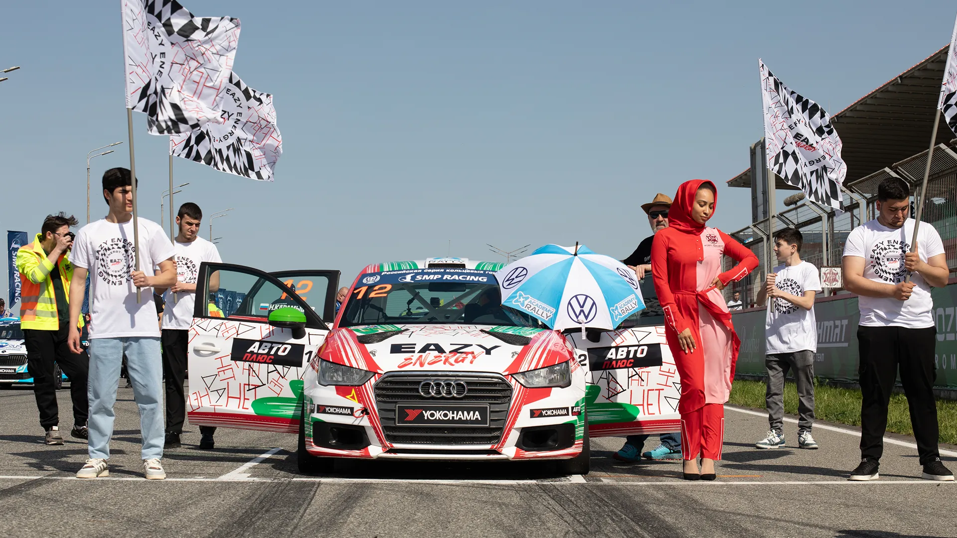
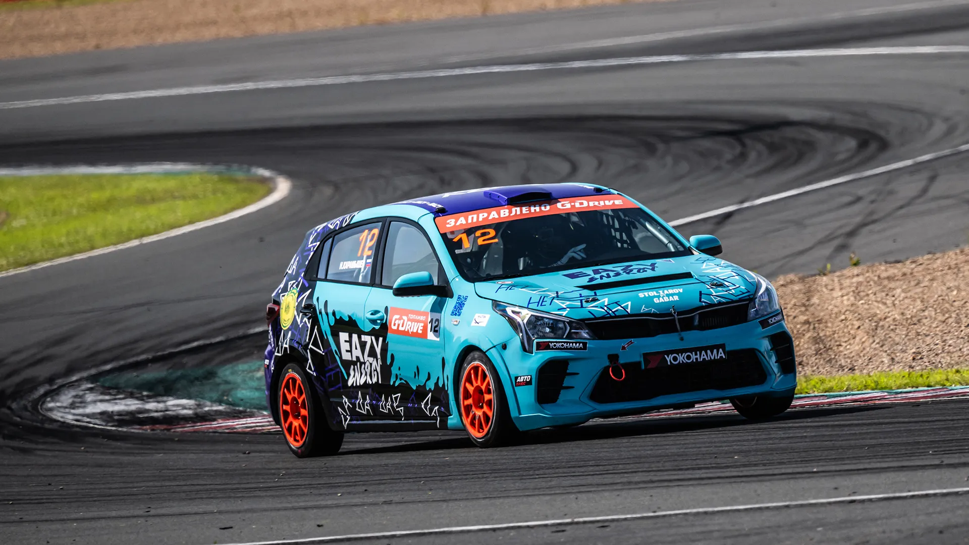
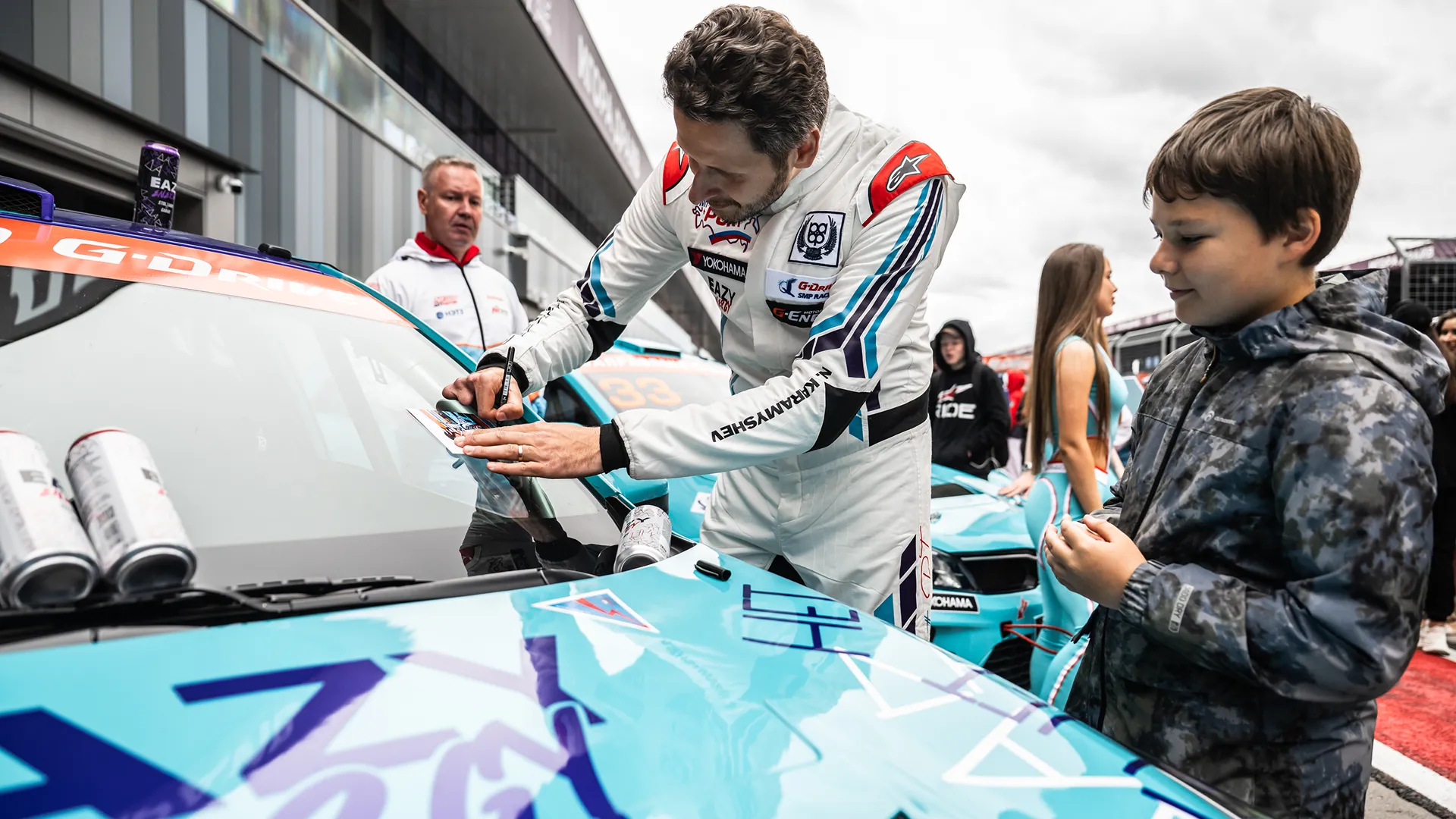
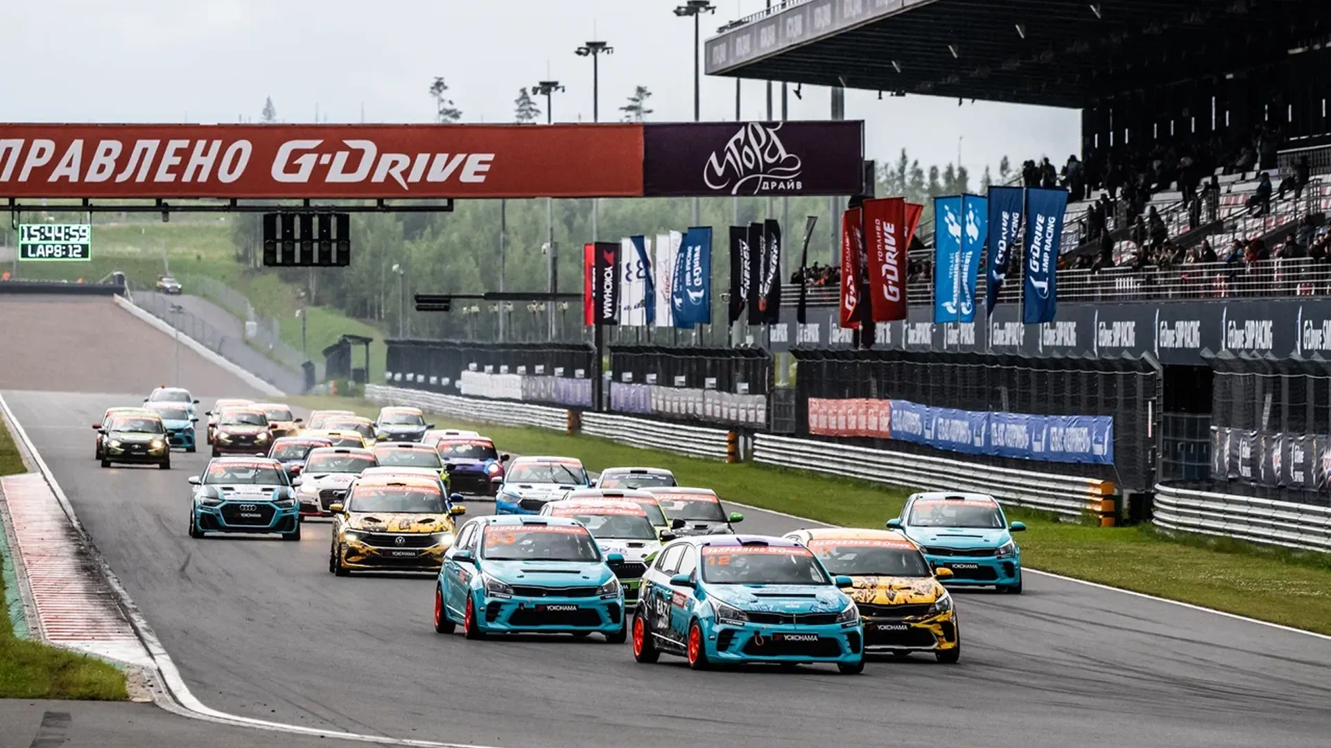
I led the creative direction across the full product lifecycle — from the first can design to the brand's national expansion. A graphic designer executed under my direction; I set the visual logic, reviewed every output, and course-corrected before anything went to approval. We designed the complete can system: the original template, material selection, CMYK finishing, and the visual logic that made each new flavour a coherent extension rather than a separate product. Beyond packaging: website, merch line, motion design for a 7-city tour in After Effects, and visual identity for racing sponsorships — car wrap, driver kit, event materials. Every touchpoint went through the same filter: does this feel native to the audience, or does it feel like branded merchandise?
How
The most important shift on this project was positional. My role transitioned from execution to art direction. A designer focusing on micro-details naturally loses the macro-perspective over time. My job was to maintain that top-level view, manage the visual system, and redirect efforts before resources were wasted on a wrong visual path. That distance is what kept the visual system coherent across two years of continuous output. The brand scaled, the product sold, the tour happened. The design held up for two years under continuous national distribution.
What it looks like
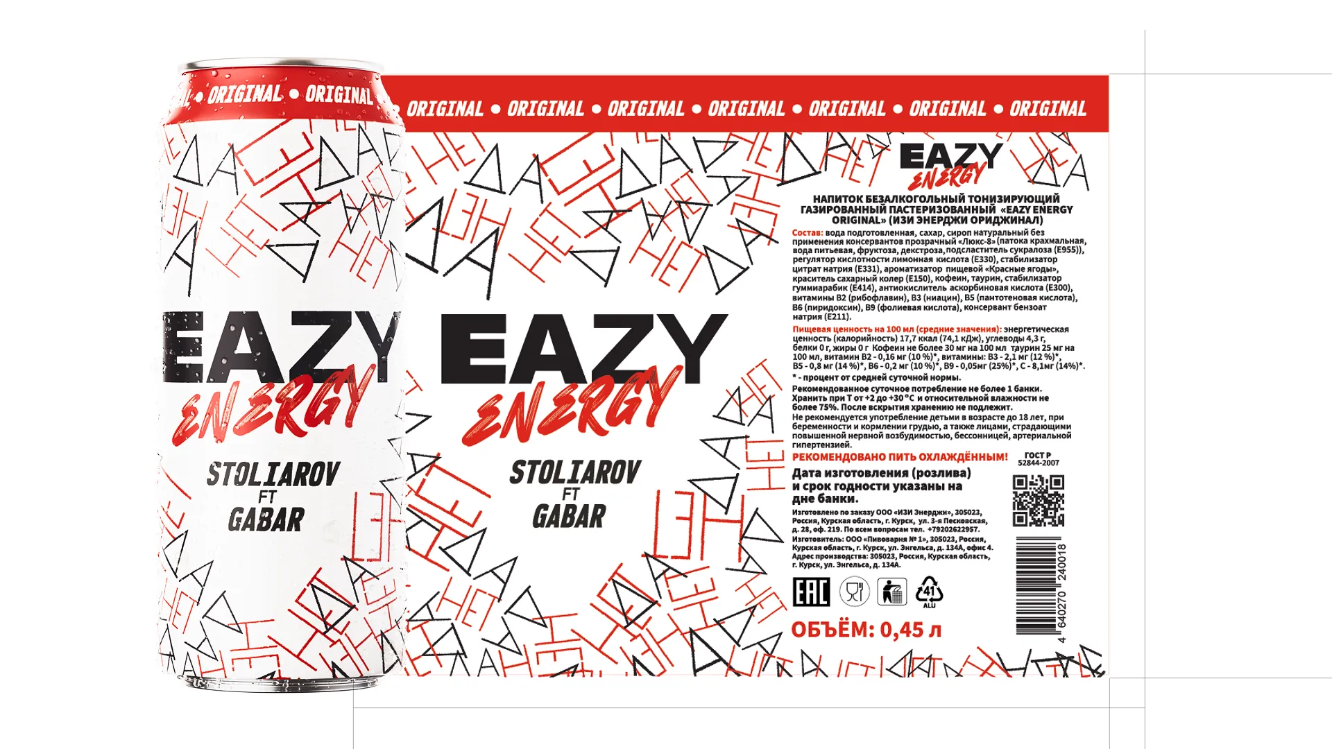
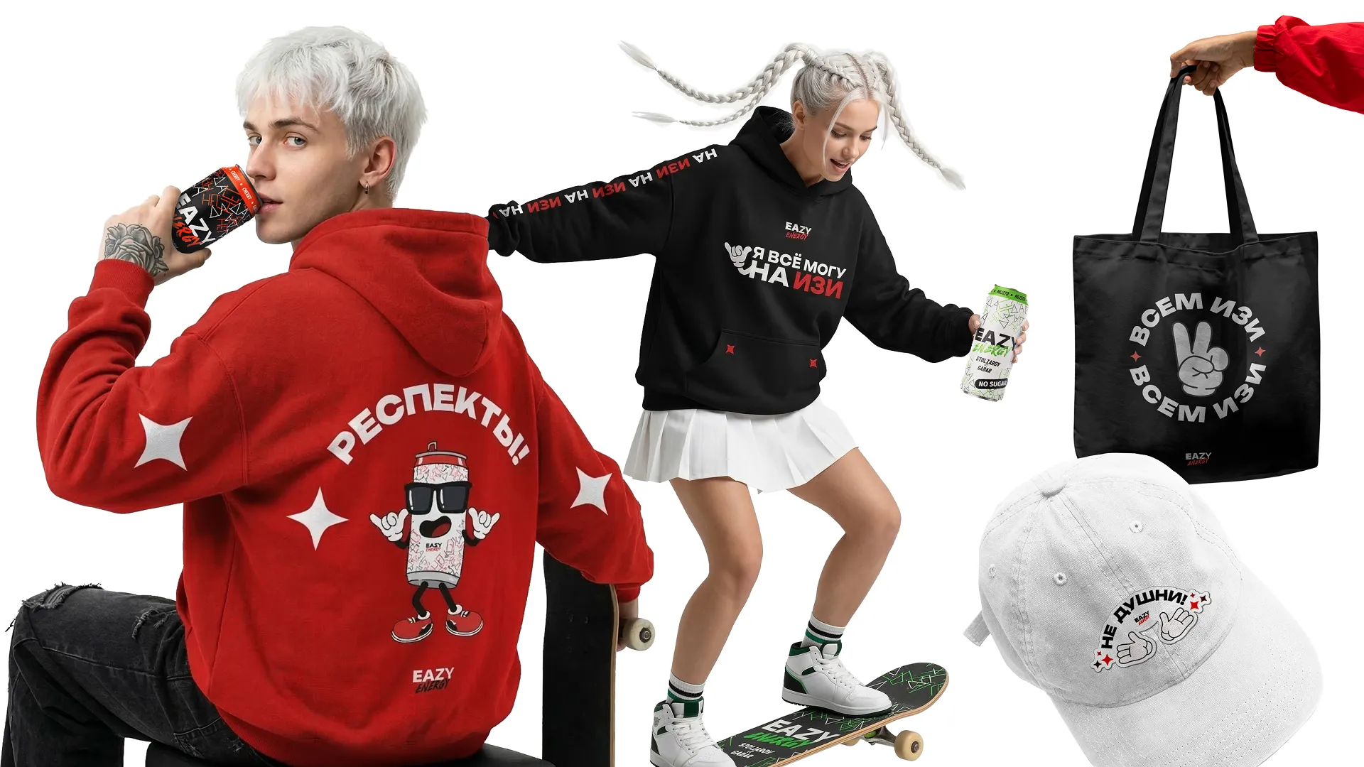
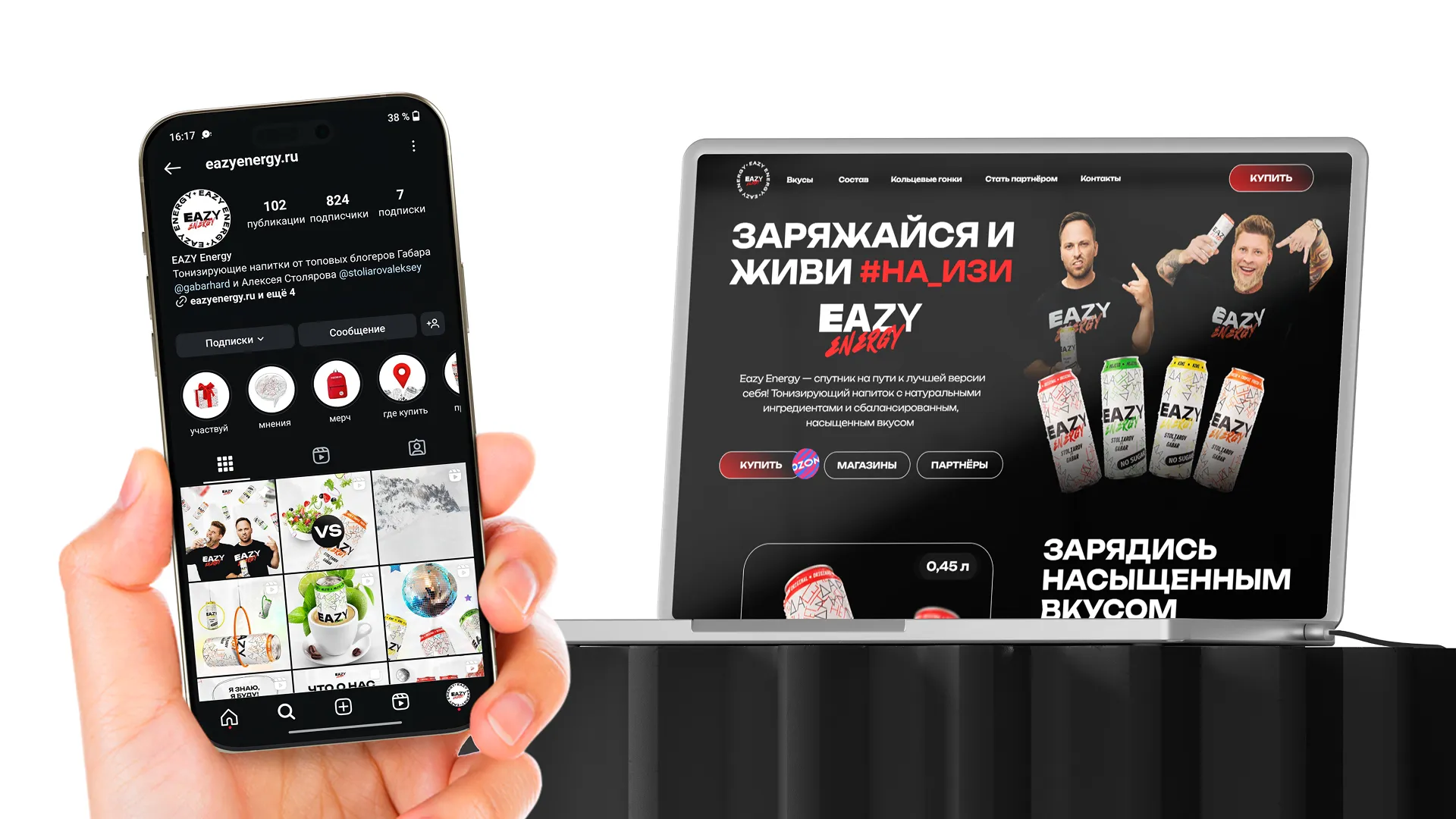
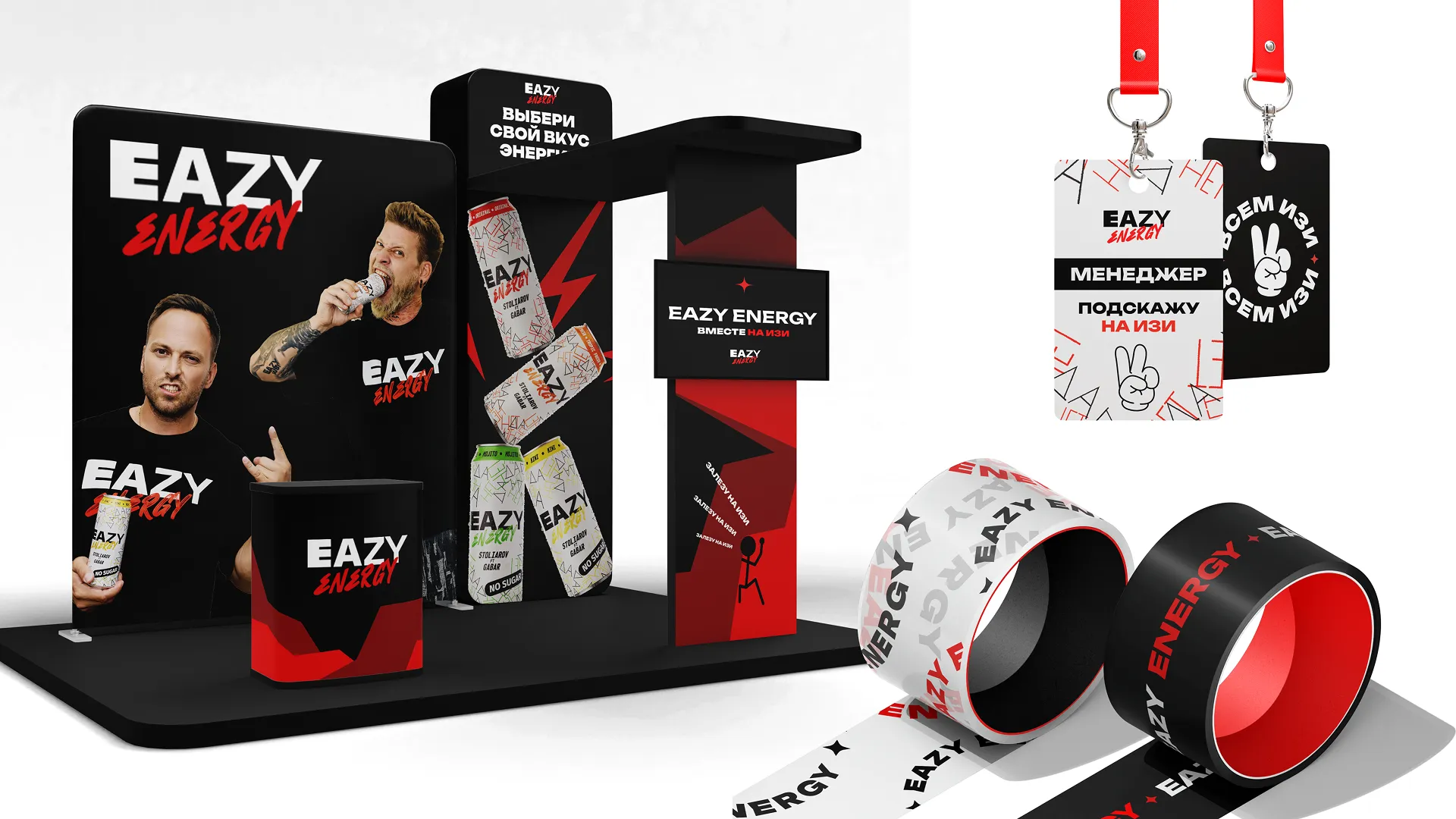
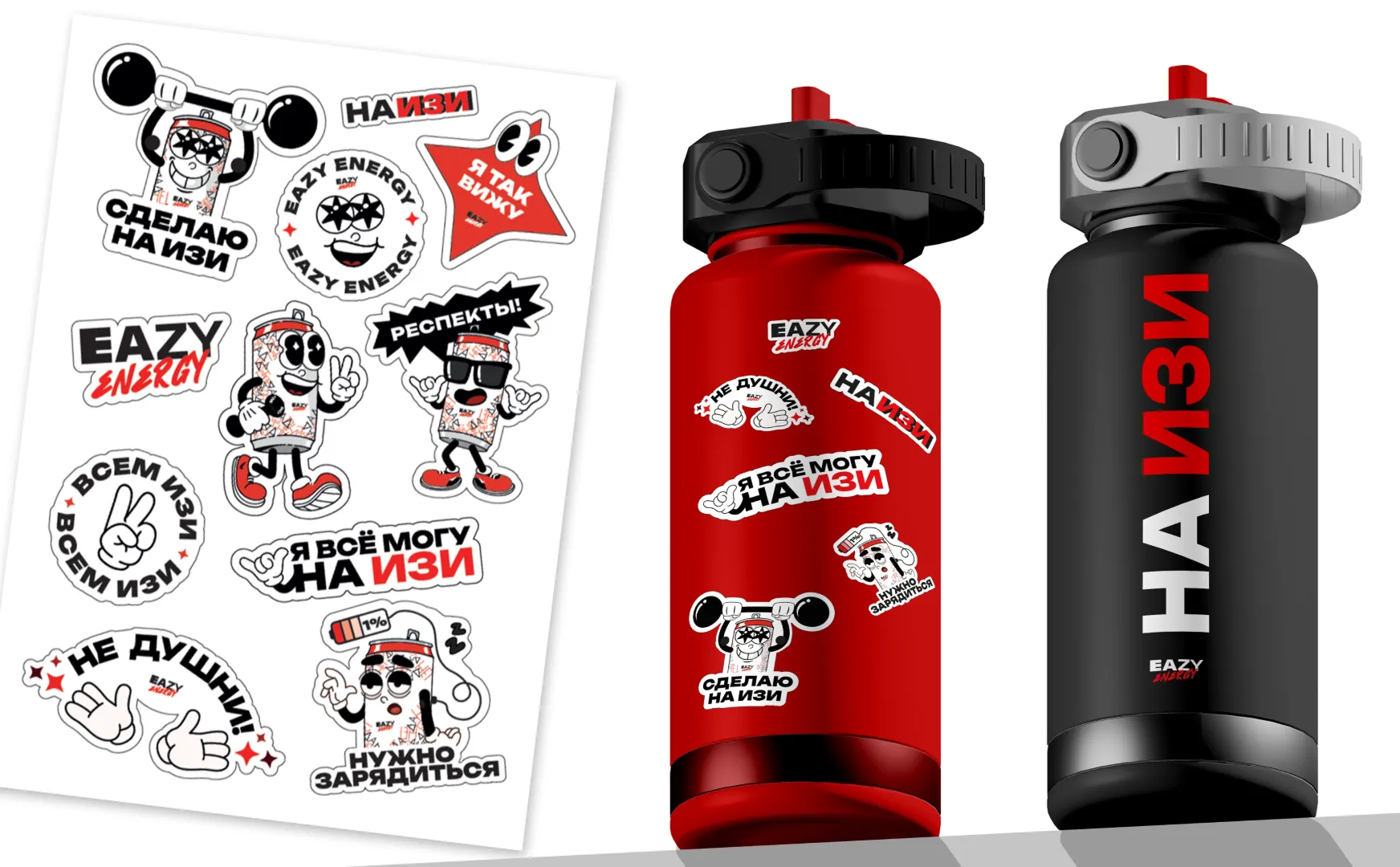
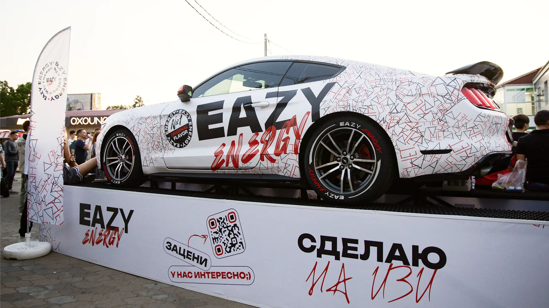
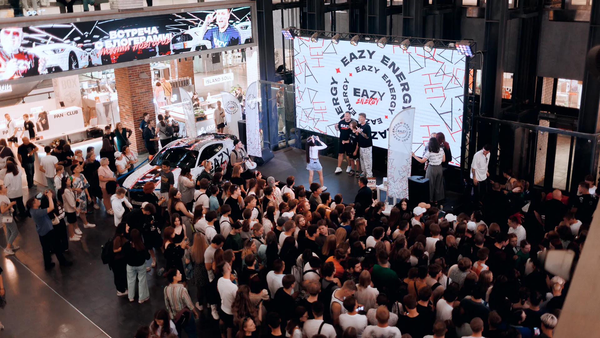
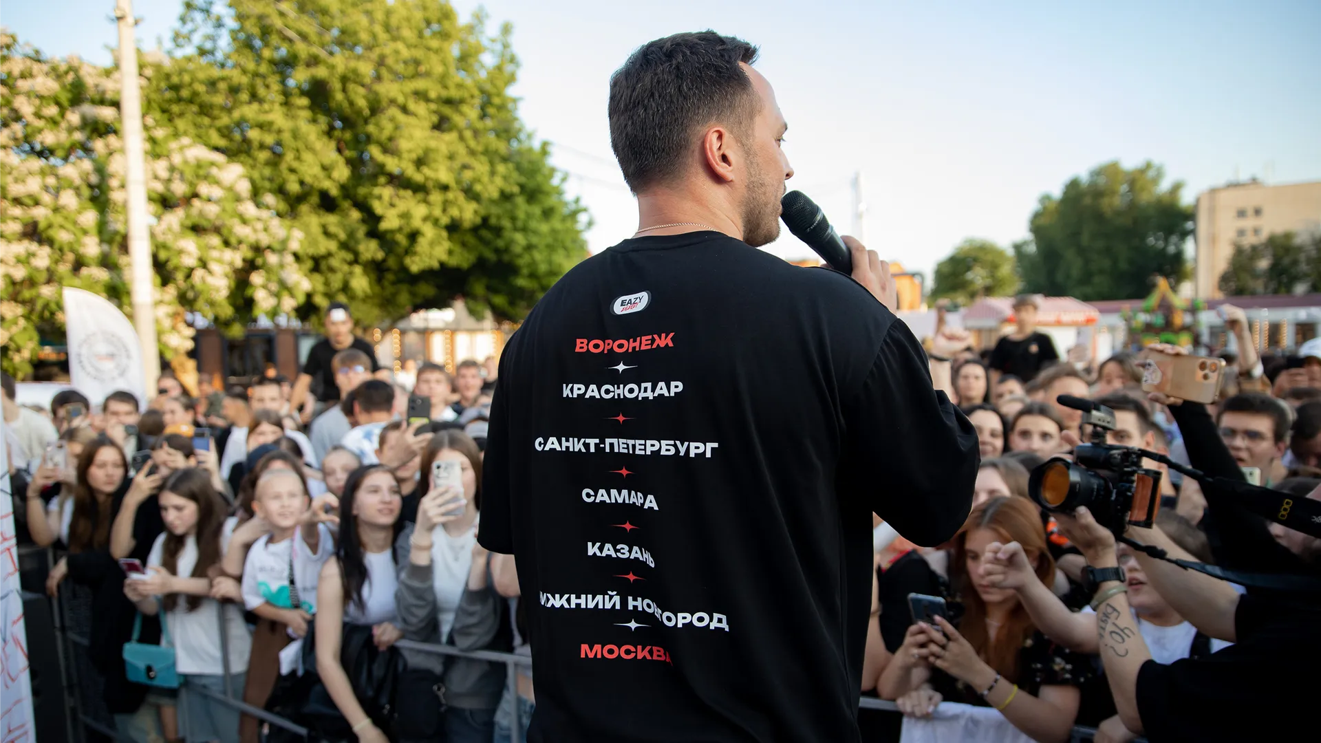

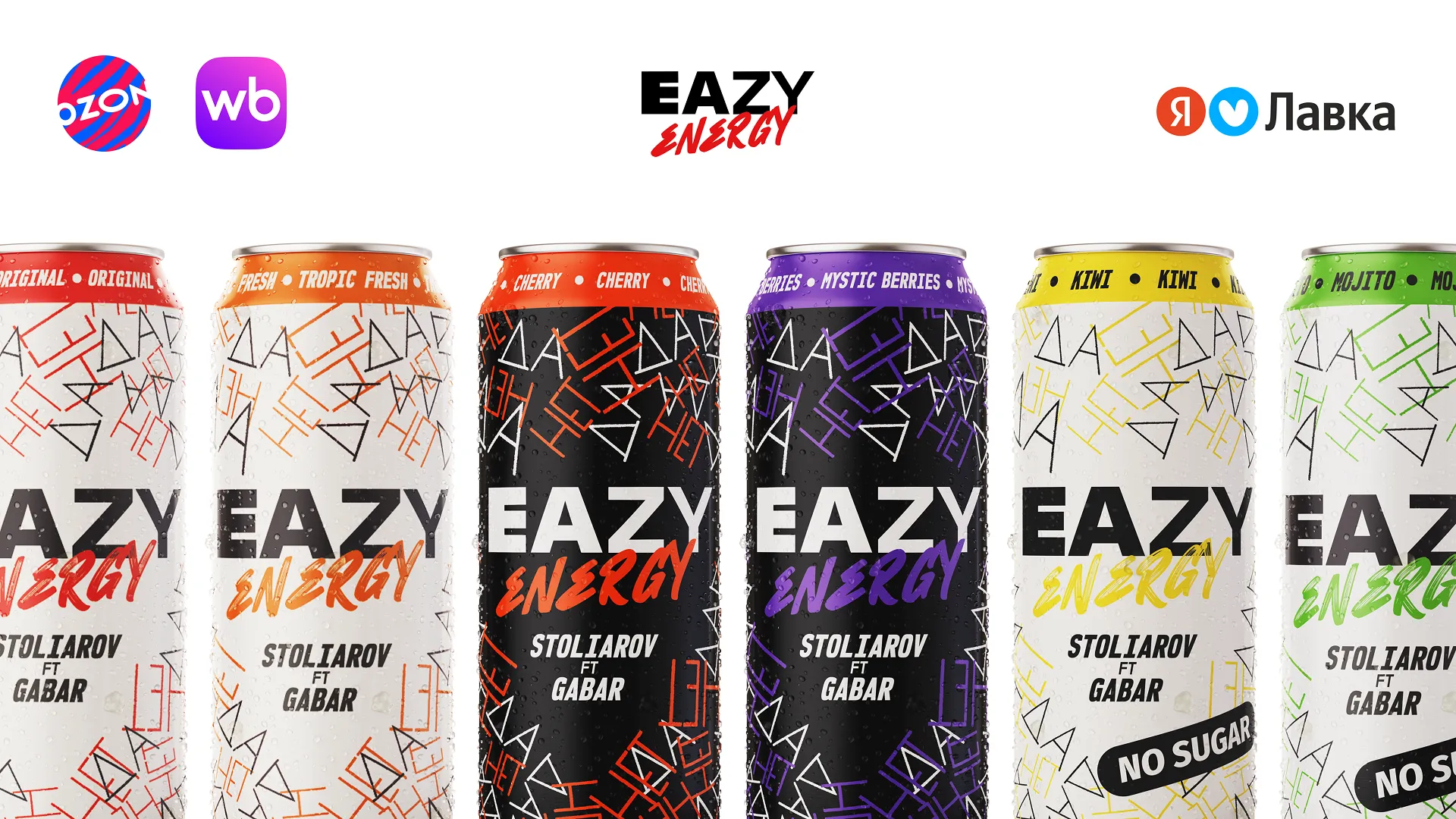
What we delivered
One coherent visual system across all flavours
Tour motion design and visual identity — After Effects production
Continuous creative direction from launch through national distribution
Across 2,571 verified ratings — 13,359 units sold on the platform alone, plus offline retail and previous Ozon distribution
The brand launched and scaled across two years of national distribution. Live on Wildberries with 13,632+ units sold and a 4.5 ★ average across 2,608 verified ratings — plus offline retail and earlier distribution on Ozon. The visual system held coherent across packaging, the 7-city tour, racing sponsorships, merch, and event materials.
Launching a new product?
Tell me about the challenge — I'll tell you where to start.
Book an intro callor email art.androsov@gmail.com