Viril
A men's health brand for the European market — built from a blank page in five weeks. The core product challenge wasn't visual: it was how to guide a user who doesn't know what he needs toward the right product without losing his trust along the way.
Why
The client came with a product — men's health supplements for the European market — but no brand. The category often falls into a dichotomy: brands tend to be either overly clinical, or highly promotional. Neither approach builds the nuanced trust required for a purchase this personal. I audited three direct competitors — Hims, Roman, and BlueChew — and found the same gap in all of them: every brand assumes the user already knows what he needs. Most don't. That wasn't a messaging problem — it was a product architecture problem.
What
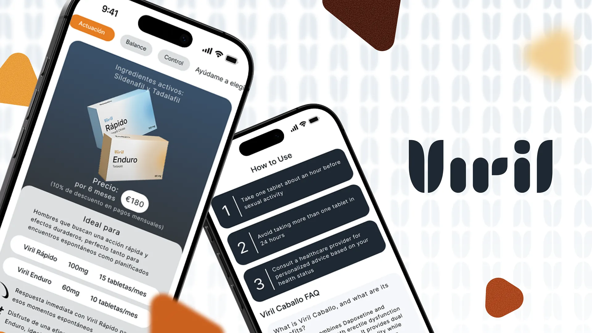
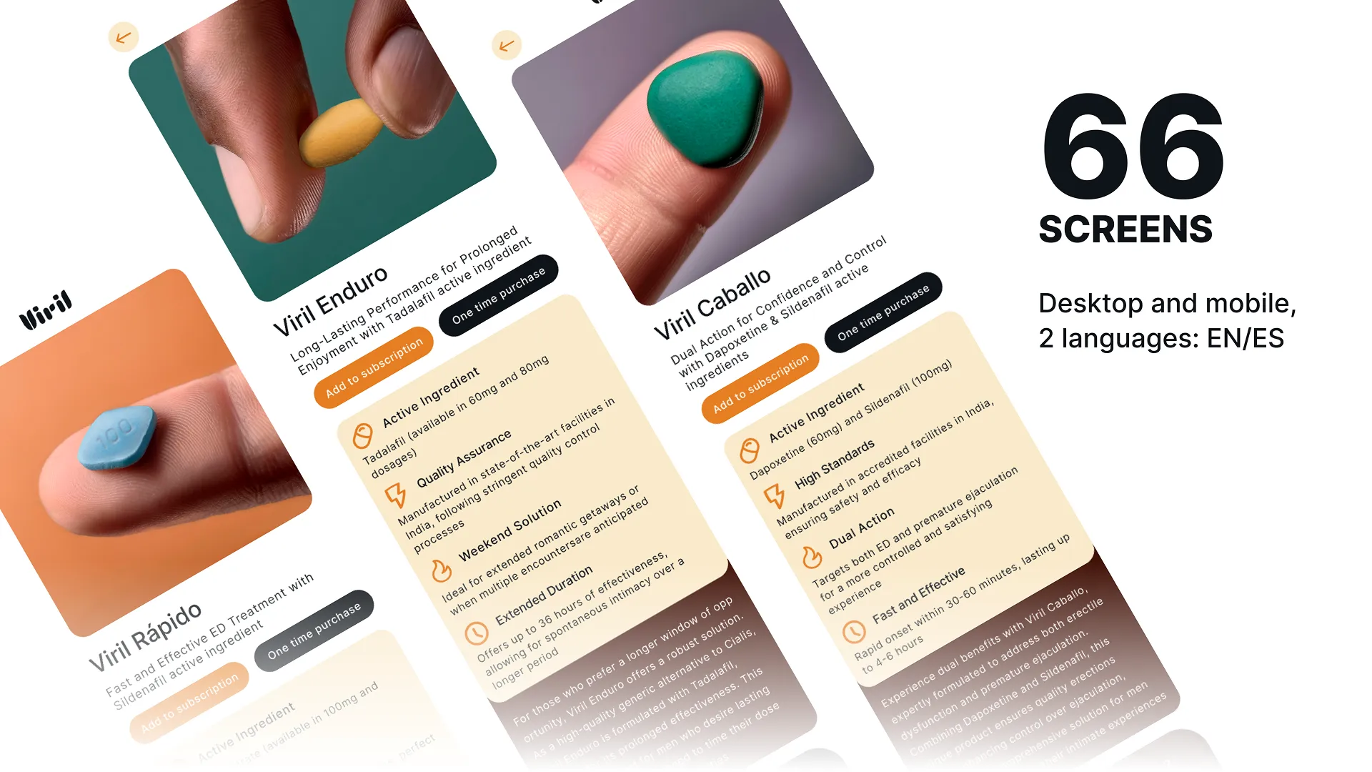
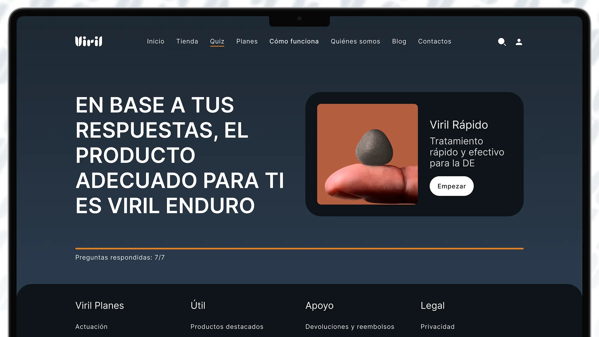
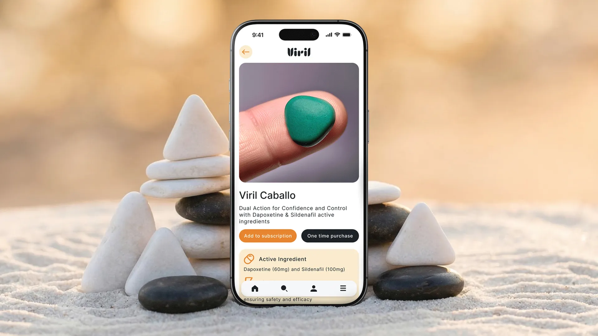
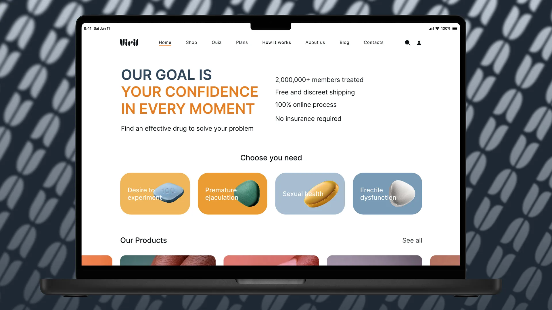
I ran the full cycle solo: competitive analysis → positioning → naming → tone of voice → visual system → UX architecture → UI in Figma. The centrepiece was a 7-question quiz that surfaces the right product based on what actually matters: tolerance to side effects, desired duration, ejaculation control, and whether the user plans ahead or acts spontaneously. The quiz replaces self-diagnosis with guided choice. Around it: 64 screens across four versions (EN/ES × desktop/mobile) — the full funnel from landing to post-purchase.
How
The competitive audit became the filter: if something was already broken in the category, I wasn't repeating it. The quiz architecture was built backwards — which variables actually differentiate the right supplement choice, and how to fit them into a flow that doesn't feel like a medical intake form. The first landing version opened with the quiz block. After usability sessions with 5 users and conversations with the client, the call was clear: speed beats depth. The first block became "Choose your need" — selection by intent (effect, action), not by product name. A click filters the catalogue to a matching shortlist. Below that, an auto-scrolling strip of every product (the "we have something for whatever you're after" signal), and only then the quiz block for users still undecided. The quiz button stays in the header on every page. Timeline: 3 days research · 1 week brand · 2 weeks UX · 2 weeks UI.
What it looks like
What we delivered
Full product: 16 screens × EN/ES × desktop/mobile
Research → strategy → naming → brand → UX → UI
Each question maps to a user-decision variable — side-effect tolerance, duration, control, spontaneity — that determines the matched product
Hims, Roman, BlueChew — full user journey documented end-to-end
The product launched and is live. The recommendation quiz, user flows, and brand voice transferred to production intact. The final build, assembled on WordPress, required adapting the visual precision to fit template-based constraints post-handoff. However, the core UX architecture and product logic held strong.
Starting from zero?
A blank page is where I do my best work. Tell me about the product.
Book an intro callor email art.androsov@gmail.com